![Parrot Golden Ratio with ratio [Recovered]-01.png](https://static.wixstatic.com/media/404ad5_5845c19c33144888aca7f2279824636d~mv2.png/v1/fill/w_827,h_465,al_c,q_90,usm_0.66_1.00_0.01,enc_avif,quality_auto/Parrot%20Golden%20Ratio%20with%20ratio%20%5BRecovered%5D-01.png)
Golden Ratio App
1: 1.618
The Golden Ratio, a mathematical ratio at approximately 1.618, is as an age old guide for creating aesthetically pleasing compositions in artwork and design. It guarantees perfect balance and harmony. I often use it in my logo design work. The only downside is it is time consuming having to calculate the size of the circles.
THE PROBLEM
How do I make the Golden Ratio easy for artists and designers for creating geometric artwork through a mobile application?
Calculating a sequence of geometric shapes to the 1:1.618 ratio seems boring and tedious for a user. So how do I make it simple and guarantee a satisfying user experience for artists and designers?
HIGH LEVEL TIMELINE
4 - 6 weeks.
MAKE OF THE TEAM
Self - initiated solo project user research and design project.
KEY GOAL
To design a mobile application for artists and designers who use the Golden Ratio.
MY ROLE
As the sole user researcher and UX designer, I created this mobile application from inception to final design.
For the initial research, I conducted a competitive analysis to understand the market and a survey to understand a users' response to the Golden Ratio and to other existing artistic apps. During the definition phase, I created user needs statements to analyse priorities. To understand the users' journey, I created a user persona, followed by Lo - Fi wireframes and a
Hi - Fi clickable prototype. In the end, I validated with users the final design to understand their thoughts and feelings. Every step of the way, I adhered to the UX principles outlined below.

UNDERSTANDING THE USER
To gain a better understanding of the market, I conducted a competitor analysis on 6 different mobile applications to understand how competitors offer a great user experience while also learning about any of their missed opportunities.
My competitor analysis revealed that the artistic apps offered a variety of creative features and some generally had a user friendly interface. However, users complained that the app features were limited. For other Golden Ratio apps, users expressed dissatisfaction about the utility of apps that measure beauty instead of something more practical for art and design. Other apps were also quite confusing in terms of their interface. Simplicity will be key in developing an app of this nature.
I created a survey to gauge individual views and experiences from designers of using the Golden Ratio.
Having surveyed and interviewed 15 Graphic Designers, I was able to understand the needs of my users and their thoughts on how easy/difficult it was to apply the Golden Ratio and whether they would be open to the idea of a mobile app. The results revealed the following:
-
Some users felt that the application of the Golden Ratio as a mathematical ratio was difficult to apply to their design work.
-
The majority of users had never used a mobile application to assist them with their design work but would be open to the idea.
-
The majority of users believed that a mobile application to assist them with golden ratio circles would be useful.
Define
To gain an understanding of the users' wants and needs for a Golden Ratio app, I have created the below user statements.
"I'm a graphic designer tasked with creating a logo for a client who wants something aesthetically pleasing and timeless. I feel under pressure because I'm faced with a tight deadline to produce a deliverable design."
Our graphic designer is struggling to meet a deadline so our solution should offer a quick and efficient method of creating a logo that meets the expectations of their client.
"As an artist, I often win commissions with my unique geometric illustrations. I'm fascinated by the wonderful effects that can be created out of circles using the Golden Ratio. However, mathematics was never my strong suit. I would love a mobile app that could calculate and apply the sizes of circles for me to ensure the composition is balanced."
The survey results suggested that some users find the mathematical aspect of the Golden Ratio difficult to apply to their work. That is why the app should do the hard work for them. Each shape must adhere to the ratio 1:1.618.
I created a user persona to complement the users statements to understand how a user might interact with the app, and to create a more natural user experience.

Finally, I created a user flow diagram to visualise the steps that a user would take to get to their final goal, and how to deliver this goal in the most effective way possible.
The User Steps
Walking in the users' shoes through this diagram allowed me to identify the features that this mobile application should focus on. Simplicity is key.

Now that I have a better understanding of the user and their needs, I identified 3 core features that the mobile application should focus on:
Demo
User feedback stated that some designers found the Golden Ratio difficult to apply to their design work. That is why the prototype will show the user a step by step demo of the re-creation of a popular logo using Golden Ratio measured circles to put everything in context.
Upload Photo
The user can upload a reference image from their gallery to work from.
Create from Scratch
The user can free style their artwork and create geometric patterns from scratch.
Ideate
Low Fidelity Wireframes
As simplicity is a priority, I created these minimal lo-fi wireframes to focus on the core features of the application. Pen and paper sketching is an effective method of helping me to visualise my ideas. It helps me identify what features will benefit the users' needs while also considering what will be as intuitive as possible. After a few iterations I came up with the sketches below.


Prototype
High Fidelity Wireframes
Moving forward, I turned the Lo - Fi wire frames into Hi - Fi prototypes. I created two prototypes: an old prototype in the left column before I got user initial feedback, and then a new prototype on the right column following user feedback. I've included the screens below to highlight my design thinking process. The clickable prototype is available here.
Before User Feedback

I had set out to create an Android app. However, user feedback stated that my original Sketch prototype did not have the qualities of an Android app.

My previous main menu page was just based on a template I created myself in my own particular style.

The app will apply Golden Ratio measured geometric shapes (1:1.618). I originally based these functions on Adobe Illustrator tools. User feedback stated that this layout was too similar to a PC and not a mobile app.
After User Feedback

Following this user feedback, I've since created a new prototype based on an Android UI template. I feel that this is more in line with a simplistic user experience than the old prototype.
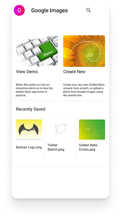
The new template has a similar menu page to that of an Android mobile app. I have also included an option for recently saved files, which is more in line with previous artist mobile apps.

Similar to the old prototype, the new app will apply golden ratio measured circles. This prototype's tools are more minimal.


Test


I validated my clickable prototypes with 3 graphic designers and 2
non-designers to gain a wider perspective on the usability of the product.
The results are as follows:
-
All 5 users loved the concept of the Golden Ratio app and believed that it could have a promising space on the market.
-
All 5 users enjoyed the demo start to finish and believed it was a simple, satisfying user journey.
-
Two of the graphic designers believed that this could be great for them in assisting with their logo design work.
-
Although 1 of the designers I tested this on believed that she required more of a deeper understanding of the Golden Ratio and its significance.
-
User feedback from the old prototype felt that the interface was too similar to a PC and not a mobile app. The new app, which was modelled from an android UI kit, appears to be more popular.
TITLE OF THE CALLOUT BLOCK
LESSONS LEARNED
As far as creating an app from concept to clickable prototype, I'm pleased with the overall test results. However, in the future, I would spend more time explaining the concept of the Golden Ratio.
Following initial user feedback, I'm very pleased with the feedback of the most recent prototype of the Golden Ratio. I think that any updated prototypes of the app should include a more comprehensive description of how the ratio would work in design practices.
I'm pleased that other designers believed that this concept was promising and that they enjoyed the overall user journey. They agreed that the Golden Ratio principles are now easier applied and could be of great use to them in the form of a mobile application.
This case study is purely conceptual and for the purposes of my UX portfolio.